Project Type: Website Content Strategy & UX Writing
Client: PawWelfare
Platform: WordPress
Role: UX Writer, Content Strategist, WordPress Implementer
🐶 The Challenge
PawWelfare is a rescue and adoption platform committed to finding loving homes for stray cats and dogs. While the initial design provided a solid layout, it fell short in one key area: the messaging wasn’t doing the mission justice.
The original content was flat and repetitive. Emotional moments—like life-saving adoptions and shelter success stories—were buried under generic phrases. Visitors didn’t immediately understand what the site was about or how to help. The opportunity was clear: use purposeful writing and better UX structure to turn passive readers into active adopters and donors.
🎯 Project Objectives
- Deliver emotionally engaging content with clear, high-intent calls to action
- Improve readability and user flow, especially on mobile
- Restructure the copy so users know what to do next (adopt, donate, contact)
- Humanize the shelter’s work without relying on guilt or cliché
- Write for clarity, warmth, and conversion
🛠️ Key Contributions
1. ✍️ UX-Focused Content Rewrite
- Transformed generic headings into emotional invitations:
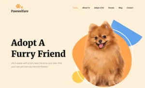
Before: “Adopt a Furry Friend”
After: “Life’s Better With a Rescued Friend. Find Yours Today.” - Rewrote all body copy for tone, rhythm, and purpose—shorter paragraphs, clearer points, and mobile-friendly pacing
- Shifted CTAs from bland to benefit-first messaging, like:
- “Adopt and Save a Life”
- “Every Donation Feeds a Rescue”
- “Meet Your New Best Friend”
2. 🧭 Section Clarity & UX Flow
- Reorganized homepage to follow a logical journey:
Hero → Why Adopt → Available Pets → Success Stats → Testimonials → Donation Appeal → Adoption Guide → Newsletter - Introduced subheadings that build emotional and narrative flow, such as:
- “Why Adopt a Rescue?”
- “Real Stories From New Pet Parents”
- “Our Impact So Far”
3. 💞 Emotional Anchoring Through Language
- Replaced negative or passive language with empathetic, uplifting tone
- Before: “Why bother shopping for pets…”
- After: “Thousands of animals are waiting for a home—adopt and give them a second chance.”
- Used inclusive, action-oriented phrasing to promote connection, e.g.,
“We’ve helped 300 animals find homes—and counting.”
4. 📱 CTA and Mobile UX Enhancements
- Cleaned up CTA hierarchy to remove redundancy and guide user action
- Broke down dense sections into bullet points, bold text, and visual anchors for better mobile scanning
- Ensured each content block had one goal and one action to avoid distraction or cognitive overload
5. 📘 Educational Rewrite for Pet Adoption
- Clarified the “Pet Parent Guide” by removing placeholder text and replacing it with real content, such as:
“Learn what to expect when adopting—from preparing your home to bonding with your new furry companion.”
⚙️ Before vs. After Snapshot
| Area | Before (Template) | After (Redesigned) |
|---|---|---|
| Hero Message | “Adopt a Furry Friend” | “Life’s Better With a Rescued Friend. Find Yours Today.” |
| Body Text | Generic filler, no structure | Emotion-driven, skimmable, action-focused |
| CTA Buttons | Repetitive and unclear | Unique, actionable: Adopt / Donate / Learn / Contact |
| Newsletter Prompt | “Subscribe” | “Get Pet Care Tips, Rescue Stories, and Updates” |
| Testimonials | Placeholder content | Designed for clarity and easy expansion |
🧠 Content & UX Principles Used
- Clarity First: Each section leads with a message or benefit
- Emotional Relevance: Appeals to compassion, not guilt
- Chunking: Short paragraphs, subheadings, and bullets for easy reading
- Consistent Tone of Voice: Friendly, warm, trustworthy
- Action-Oriented Language: Clear CTAs with real-world outcomes
- Mobile-First Review: Designed and tested for readability on phones
📈 Results & Readiness
- A polished website experience with human-centered storytelling
- Clear messaging that drives action: adopt, donate, reach out
- Optimized for mobile reading and SEO fundamentals
- Scalable structure for future blogs, events, and new adoptable pets
- User-friendly language designed to build trust and long-term engagement
🐾 Why This Project Stands Out
This wasn’t just a copy cleanup—it was a mission alignment project. The right content and structure gave meaning to every click and scroll. With its improved tone, flow, and clarity, the site now connects visitors emotionally and guides them toward real outcomes: adoptions, donations, and community growth.
In the end, the words helped do what the shelter set out to achieve: change lives—one pet at a time.


