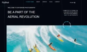
Project Type: UX/UI Revamp & Front-End Design
Client: FlyShot (Commercial Drone Photography & Videography)
Platform: WordPress + Elementor Pro
Role: UX Designer, Visual Strategist, Front-End Developer
🧩 The Challenge
FlyShot offers high-resolution drone photography and aerial videography for tourism, real estate, and outdoor events. Their existing site was built on a bloated template designed for general eCommerce use—but it lacked direction. Content blocks were repetitive, icons were mismatched, and mobile responsiveness was inconsistent. The entire site felt more like a placeholder than a real brand.
The objective was to transform it into a cohesive, fast-loading, and visually polished experience that reflects the brand’s cutting-edge tech and visual artistry.
🎯 Project Goals
- Build a clean, high-conversion layout for drone services and product listings
- Eliminate visual clutter and redundant content
- Restructure the site for easy scanning, intuitive navigation, and clear messaging
- Maintain consistency in fonts, colors, and icons across pages
- Make it flexible enough for future growth: blogging, client success stories, and memberships
🛠️ Key Improvements Delivered
1. 🧱 UI Reorganization & Layout Overhaul
- Removed duplicated blocks (e.g. “Travel & Tourism” repeated in multiple places)
- Standardized section spacing and vertical rhythm for readability
- Applied a modular grid system to maintain balance across desktop and mobile breakpoints
- Reorganized key pages around an inform → impress → convert structure
2. 🎨 Visual Hierarchy Redesign
- Used typography, weight, and spacing to establish clear scan paths
- Simplified vague headings like “Say About Us” to clear, SEO-optimized titles such as “What Our Clients Say”
- Moved CTAs to visible, contextually relevant positions without overwhelming users
3. 🛒 Product Display Cleanup
- Designed clean, responsive product blocks with hover effects and consistent price formatting
- Added hierarchy within product cards (e.g., title → price → CTA), ready for WooCommerce or CPT integration
- Built a scalable structure to support upsells, filters, and blog-to-product linking
4. ✍️ Content & Microcopy Refinement
- Rewrote awkward or grammatically incorrect copy like “You have any quetion?” to “Have a question? Let’s talk.”
- Replaced overused buzzwords with clear, benefit-driven content
- Edited testimonials for tone, grammar, and trust-building clarity
5. 📱 Mobile Experience Optimization
- Resolved stacking issues, fixed overlapping elements, and resized touch targets
- Built device-specific spacing and alignment rules using Elementor’s responsive controls
- Made buttons, headings, and product blocks easy to interact with on small screens
🧾 Before vs. After Summary
| Area | Before | After |
|---|---|---|
| Hero Section | Text over busy background, unclear CTA | Focused messaging, layered text, and action-first CTA |
| Services Block | Duplicated items, poor visual rhythm | Unique services with tailored icons and layout |
| Product Listings | Cluttered and inconsistent spacing | Responsive grid with hierarchy, hover states, and clean layout |
| Navigation & Footer | Generic, cramped | Streamlined menu and structured footer with logical grouping |
| Testimonials | Low-credibility quotes, poor English | Edited, styled, and structured for trust |
| Blog Previews | Flat design, poor links | Optimized excerpts, clear links, and visual differentiation |
💡 UX Thinking Behind the Redesign
- Hierarchy Before Aesthetics: UI was built to prioritize user decisions, not just decoration
- Less Repetition = Less Fatigue: Removed redundancies to keep attention sharp
- Consistency Builds Trust: Fonts, colors, button styles, and iconography unified throughout
- Designed for Mobile-First Scanning: Optimized visual anchors for on-the-go users
- Every Section Has a Goal: Whether it’s converting, informing, or reinforcing brand trust
🧠 Skills Applied
- WordPress + Elementor Pro customization
- UX copy editing and CTA restructuring
- Responsive design & layout optimization
- Grid system implementation
- WooCommerce-ready structure (scalable for future use)
- Image asset optimization & speed tuning
- UI/UX audit and consistency enforcement
📈 Final Results
- A fully responsive, branded experience that aligns with FlyShot’s high-tech visual identity
- Streamlined flow that reduces bounce and keeps users engaged
- Mobile-first design that looks great and works well across all devices
- Layout and content that are now conversion-ready—for bookings, product sales, and inquiries
- Modular, scalable structure that can easily support future growth: blog, video embeds, or online store
🚀 Why This Project Stands Out
FlyShot is more than just a portfolio—it’s a full-scale brand site that needed polish, structure, and performance to match the premium quality of its drone visuals. This project showcases my ability to go beyond templates: to spot flaws, simplify interaction flow, rewrite messy copy, and deliver a polished product that’s ready for business.
Whether you’re a creative brand, tech service, or ecommerce business, the FlyShot process shows how small UX decisions translate into big business value.


